Pages and components
The page form, building from components and the preview
Every page in VMHub has two parts. The Edit tab holds the general fields — the title, hero, categories, tags, teaser and status. On the Content tab you build the page from components: text, images, buttons, listings and more, arranged in rows and columns.
The screens in this chapter come from the VMHub demo, where you can look around yourself.
The general fields
Every content type has the same form. At the top, the Hero is the page header with a title, text, button and image. Your Primary category decides where the page belongs and what its address is; further categories and tags put it into more listings. A Teaser says how the page appears in cards and when shared.
The right panel changes the page's status (draft, published), alias, menu, page details and scheduling. Fields that apps add have a tab of their own.
Building from components
The Content tab shows the page as it will look. Content goes into rows — sections with one, two or three columns, their own background and spacing — and you put components into them.
Hover over a component to see its toolbar: move, edit, duplicate, hide in a language and delete. Drag components between columns, too.
Adding a component
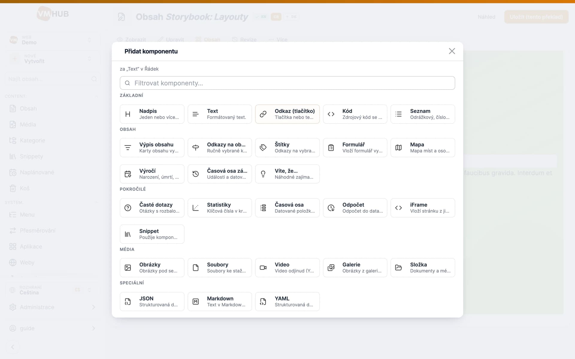
The + button above or below a component opens the component chooser. Type part of a name, or pick from the groups Main, Content, Advanced, Media and Special. What each component does is shown in the Component tour.
Editing a component
A component is edited in a dialog: the content at the top, its look (alignment, style, number of columns) below. Promote to library turns it into a snippet you can use on other pages too — see Snippets.
The dialog only prepares the changes. The Save button at the top right sends them to the site; Preview shows the page as visitors will see it first.