Component tour
Every component on its own demo page
The demo storybook gives each of the VMHub components a page of its own with every variant of its settings. Look at a component before you use it — and try it right away in the demo admin. How to add components is covered in Pages and components.
Components in the chooser
The component chooser sorts the components into the groups Main, Content, Advanced, Media and Special. Type part of a name to narrow the list. Which components it offers depends on the site's apps: Atlas adds the map and the timeline of entries, for example.
Rows and columns
One to three columns, the ratio, theme, spacing and background.
Hero
The page header: centred, beside an image, with video or as a slideshow.
Headings and text
Headings with icons and formatted text.
Images
In rows, a grid or a slider.
Gallery
Images from a media gallery.
Links and buttons
Buttons, outline buttons and text links with icons.
Content links
Hand-picked cards of pages or other sites.
Content list
Cards chosen by category, type and sort order, always up to date.
FAQ
Questions with expandable answers.
Stats
Key numbers in circles or boxes.
Timeline
Dated events one after another.
List
Bullets, numbers or icons, with links.
Files and folder
Documents to download, one by one or a whole folder.
Video
YouTube, Vimeo or an uploaded video.
Form
Contact and other forms from Forms.
Map
Places and people on a map with a list and filters.
Countdown and code
A countdown to a date and highlighted source code.
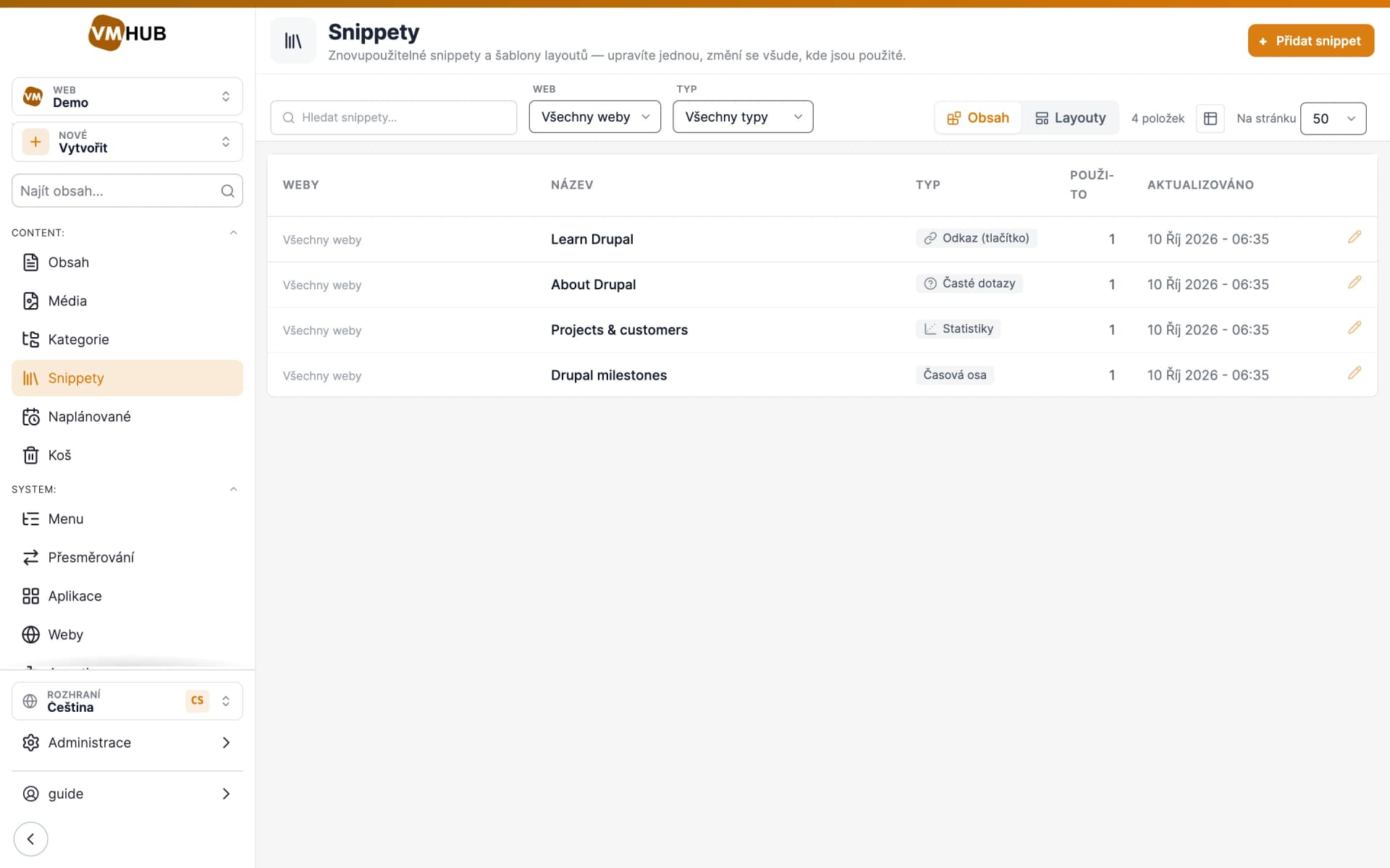
Snippets
Library blocks used on several pages.